Research Part 1 (Self Publishing Platforms)
Wix
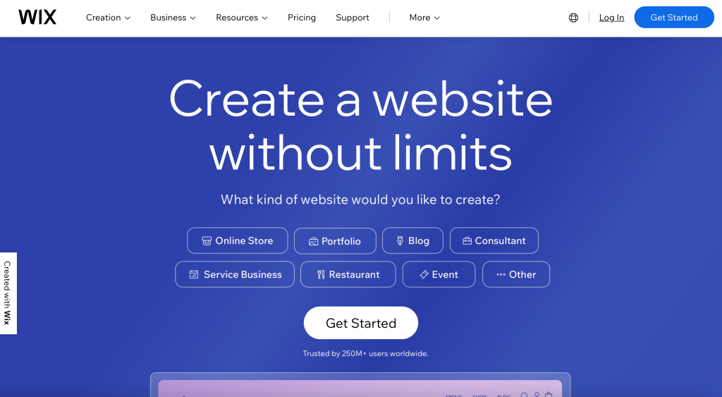
Wix.com Ltd. is an Israeli software company, publicly listed in the US, that provides cloud-based web development services. It offers tools for creating HTML5 websites and mobile sites using online drag-and-drop editing.
Weebly

Weebly is an American web hosting and web development company headquartered in San Francisco and is a subsidiary of Block, Inc. It was founded in 2006 by Chief Executive Officer David Rusenko, Chief Technology Officer Chris Fanini, and former Chief Product Officer Dan Veltri.
Big Cartel

Big Cartel is a simple e-commerce platform with an intuitive editor that lets you build a website quickly. Choose from three plans, which vary in price based on the number of products you want to sell.
Webflow

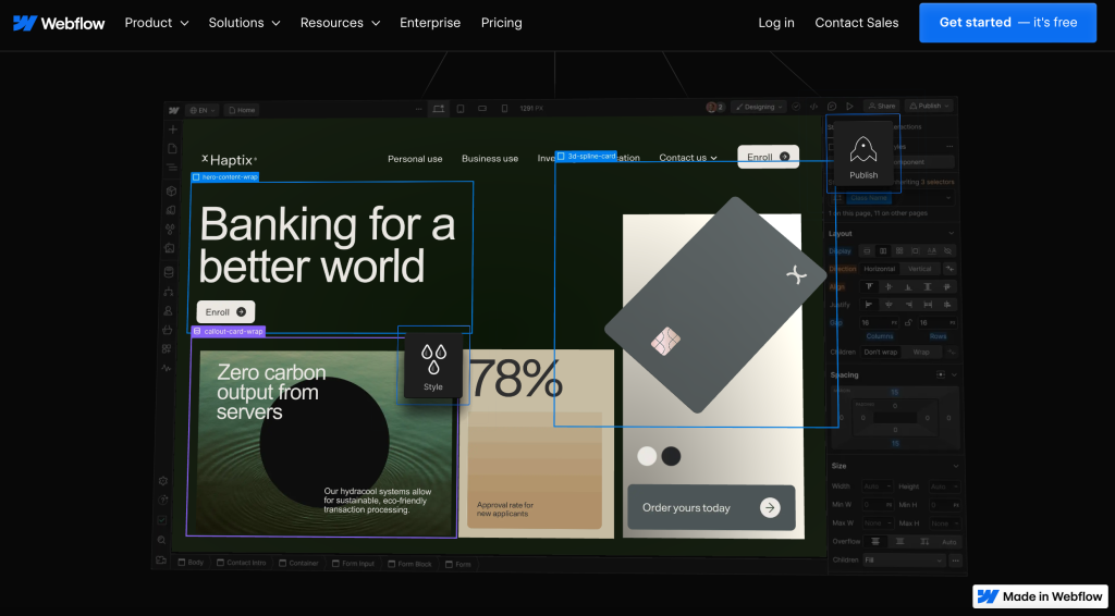
Webflow, Inc. is an American company, based in San Francisco, that provides software as a service for website building and hosting. Their online visual editor platform allows users to design, build, and launch websites. According to W3Techs, Webflow is used by 0.6% of the top 10 million websites.
Squarespace
Squarespace, Inc. is an American website building and hosting company based in New York City. It provides software as a service for website building and hosting, and allows users to use pre-built website templates and drag-and-drop elements to create and modify webpages.
Research Part 2 (Specification)



Research Part 3 (Desktop Websites)
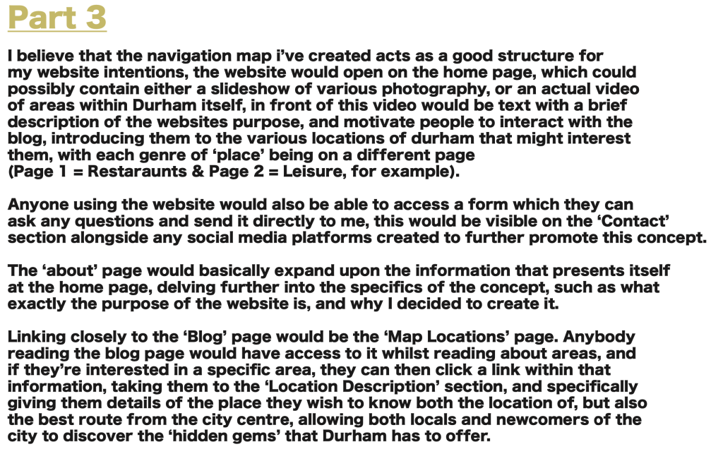
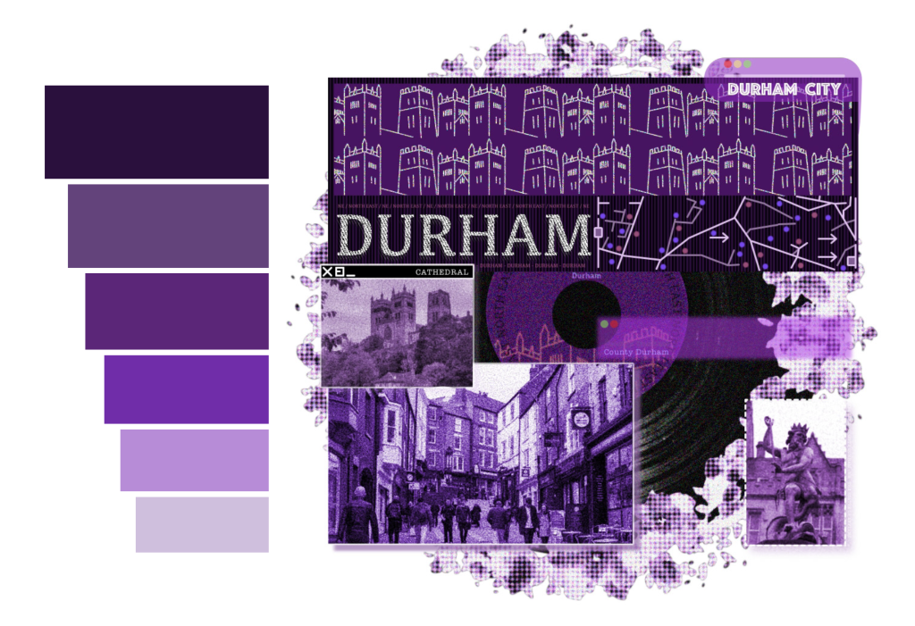
For my website, I decided to focus on the City of Durham and the many instances it has to offer in terms of entertainment, food, leisure, and more. I decided to go with the colour of purple as I believe this best represents Durham, whilst also allowing for a nice and simple aesthetic that helps add to the experiences that the website has to offer.

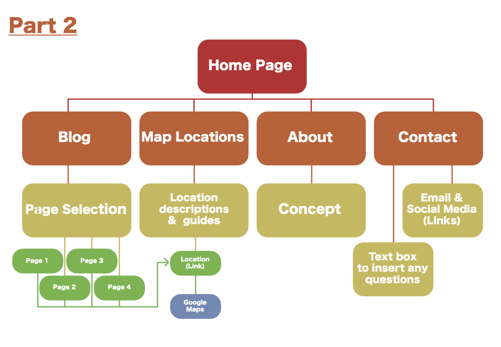
The website will feature various subpages acting as a gallery of information and photography, explaining the specific areas that Durham has to offer, these images will also contain hyperlinks to the corresponding website, allowing people to further search up things that they are interested in, or even book events such as a museum visit or a ferry ride.

The website will contain a contact page that allows for people to send any enquiries that they may have, for things such as ideas for potentially new locations to be added to the app, or extra information that could be expanded on.

Finally, the website will end with a blog page explaining various examples of visits and what they had to offer, giving extra information and guidance to people such as parents who may be interested in taking their children to ‘Adventure Valley’ for example, and getting a genuine example of a real life scenario.

Research Part 4 (Mobile Prototypes)
Before starting my app, I begin to look for a fitting font and colour style. Keeping with the theme of purple, I select around 6 shades that work well in contrast to both light and dark backgrounds, I decided to go with the font ‘K2D’ as I admired its style and. thought it fit well alongside my app and website, it even had various font-weights, so I chose to mainly use ‘thin’, ‘regular’, ‘bold’, and ‘extra bold’.

I then started to design the homepage, I think the choice of using purple was a good idea for this, as it fits well as a theme in general, but also very befitting of Durham itself which is heavily associated with ‘Palatinate’ purple.


After settling with the design concept of the app, I began to branch various pathways from the home page, one example is that ‘locations’ can lead to ‘Site Seeing’ which can then lead to ‘Beamish Museum’ and from there, a hyperlink will lead to the official website of Beamish Museum, this applies to every pathway. I also added a ‘home’ button to every section, which of course links back to the home page, it ‘doesn’t take up too much space but is clearly visible, I went for a similar idea with the majority of my pages ‘Titles’, putting them in areas that allow for the background images to still be seen and appreciated, I also decided to include smaller titles in front of the subjects in things such as ‘Site Seeing’ and ‘Leisure’, but thought it would be fitting to have the sign of the restaurant itself as a button on the ‘Restaurants’ section, which would still link to the relevant website. The motion of the app also includes a slow fade into the next page, this is easy on the eyes, but also works quite well due to the consistent theme of purple throughout the app.

Finally, I add text on each page to help guide people across the app and help them to understand specifically what the page is offering, I also have relevant photography behind the text, with an arrow indicating the ability to scroll further down the page, aided of course by the scroll bar that would appear on the side of the screen.



I chose to use Adobe XD for the development of my app, as I found it to be a very useful way of designing prototypes and concepts, whilst it is simple, I still benefitted from it and was able to create an accurate portrayal of what an app for the website could portray. The app icon is also simple, containing both the Durham cross, and shades of purple befitting Durham.
Part 5 – DIGITAL POSTERS / PROMOTIONS

Part 6 – PRINT / ON DEMAND & DIGITAL PUBLISHING
is an online magazine featuring curated stories about real people. We are passionate about interviewing people from self-employed enterpreneurs to established CEO’s and represent the times from urban culture to politics and everything in between. We usually keep an eye out for more contributors as editors, writers or photographers. So, do not hesitate in sending us a message.